Maps of the Hong Kong MTR
Time-Scaled Maps
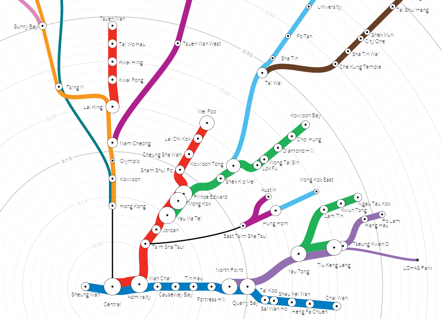
I was intrigued by the time-scaled diagrams of Boston's & DC's subway lines and commuter rail created by Peter Dunn of Stone Brown Design and thought that something similar should exist for Hong Kong.
Hong Kong does not have the same hub and spoke layout as Boston, so I chose Central station for the "starting point" (though a map centered on Admiralty, Mongkok, or Hung Hom would be an interesting follow-up). My first draft attempted to display train frequency information, as well as trip duration, though I am not certain that I handled the transfer stations in a logical way. For instance, Yau Ma Tei has twice as many trains passing through it as Jordan, but does that actually mean the station is twice as busy?
In a later version, I set the "start time" at the top of the page and drew parallel streams downward to every possible destination. This allowed me to more clearly show how much time is spent on trains vs. walking through transfer stations. Lastly, I included two new lines that are still under construction, as a reference for later.
If you like this kind of map, they exist for The San Francisco Bay Area & Philadelphia as well.
Playful Translations
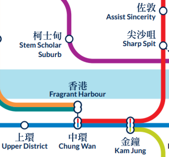
Each station in the MTR has a name in Chinese and English. For some, the names are translations of one another (e.g. "Central" and "中環"). For others, a name was chosen in one language and the name in the other language is a transliteration that sounds the same, but is not a native word (e.g. "柴灣" to "Chai Wan" or "Jordan" to "佐敦").
This map highlights those differences by swapping them. All stations (and other landmarks) with translated English names now have transliterated names. All the stations that usually use transliterated names are translated here. Just a bit of fun to see the neighborhoods of Hong Kong in a new light.
Accessible Transit
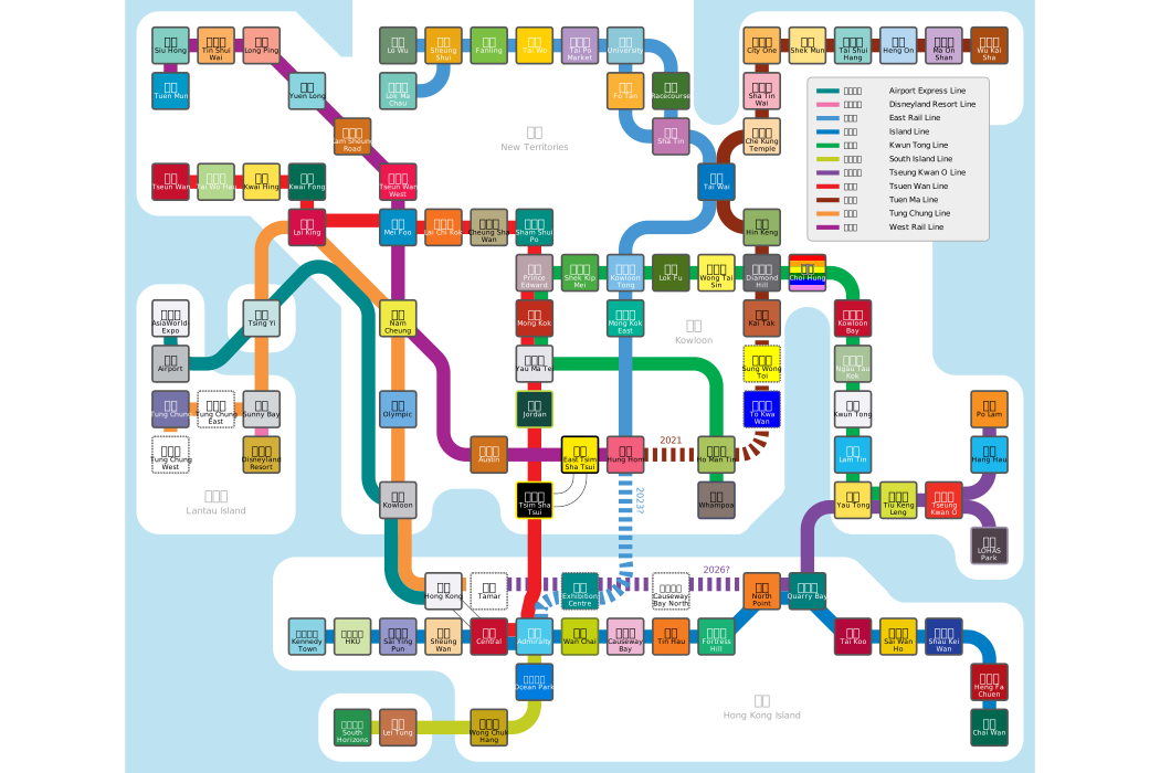
Hong Kong's MTR may not have the grand passageways of St. Petersburg's subway or the art nouveau style of Paris' Metropolitain, but it definitely has a lot of color. Colors were designed to clearly distinguish one station from another and to highlight transfer points with bright colors. This was especially useful when Hong Kong's literacy rate was still quite low.
Today, most adult Hong Kongers do not struggle with reading the signs, but my three-year-old daughter still found the station colors very helpful. To help her visualize how we travel around the city and to introduce her to maps, in general, I made this. Instead of focusing on the colors of the lines, it draws your eye to the colors of each station, making it easy to track as you pass.
Below, From Above
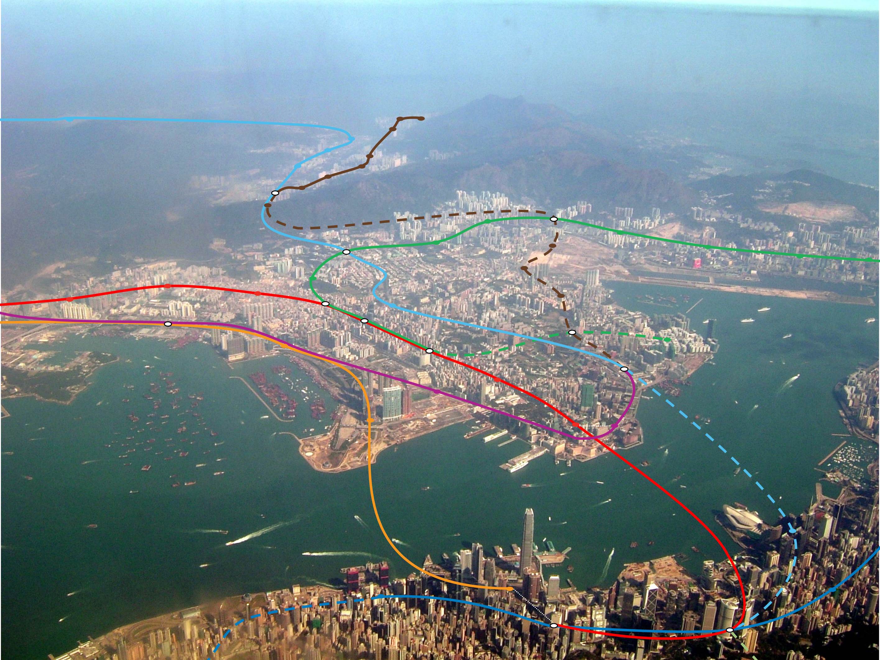
Another different perspective of the MTR network, this map plots the lines and stations onto an aerial shot of Victoria Harbour.